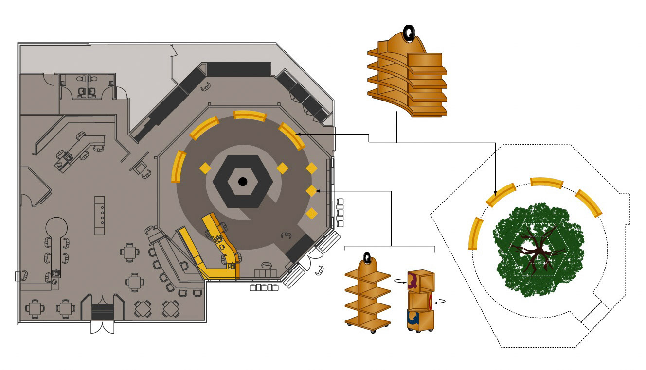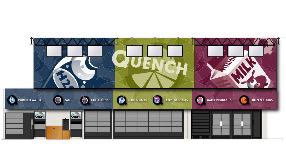


It all started with a name so simple, it could be expressed with just one letter. The letter “Q” immediately took this emerging brand full circle with its elegant disruptor. Aligning convenience with simplicity was such a pure thought, we built the entire store around this one-letter name, from the floor plan, up—yes, only in Canada can one get away with this. With equity from its Canadian Tire parent brand, Q convenience stores had the freedom to kept things light, spacious, and inviting.
